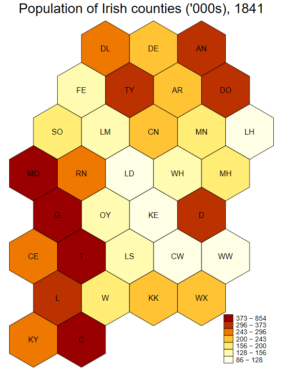
It is occasionally useful to create maps where each geographic unit is given equal visual prominence. This is particularly true in economics/political science, where land area can be poorly correlated with the information you’re really trying to depict. For example South Dakota has about twice the land area of Kentucky, but has fewer than one-fifth of the population.

One way to deal with this is a hexagonal tile grid map, and NPR gives good examples of their application to U.S. states. I’ve adapted code to facilitate something similar for Ireland’s 32 counties in Stata. (I was working with 1800s population data, before Northern Ireland existed, so the code is based on the 32 counties.) The images are generated by spmap and maptile, and you can use their in-built options to change the appearance. The map is implemented as what maptile calls a “geography”, and I’ve named this geography eirtile.

The first requirement is installation of both spmap and maptile, both of which are available from the SSC.

Next, click this link to download the eirtile database and coordinate files. These need to be unzipped into the maptile geographies folder, located within your Stata ado folder. For me that’s C:\ado\personal\maptile_geographies though it might be different for you. You may also want to download this 1841 Census population file to replicate the example.

An important requirement is that you have a variable named countyid to link your data to the database coordinates. The ordering is alphabetic, so Antrim is countyid=1 and Wicklow is countyid=32. The code will still run if observations are missing, so it’s not the end of the world if you don’t have data from the six NI counties.

The code below generates the 1840 population image.

insheet using "1841pops.csv", clear names
destring pop, replace ignore(",")
gen pop_per_thousand = round(pop/1000)
sort County
gen countyid = _n
maptile pop_per_thousand, geog(eirtile) geoid(countyid) twopt(title("Population of Irish counties ('000s), 1841")) nq(7)

The first three lines open and clean the data. Lines 4 and 5 generate the necessary countyid variable, which serves as the link between your data and the mapping software. The last line calls maptile, tells it to map the population variable of interest, use eirtile as the geography, and that countyid is the identifier variable. The latter options (twopt and nq) are maptile-specific commands and you should consult that program’s help file for details. This help file also shows you how to change the colours, label the missing data, etc.

//

I’ve posted before about problems with line widths when exporting tables from Stata. Here is one trick to solve having an excessively wide addnote at the bottom of the table.

Ensuring you have pre-loaded the booktabs package, add the following line to the header of your LaTeX file:

\newcommand{\tabnotes}[2]{\bottomrule \multicolumn{#1}{@{}p{0.70\linewidth}@{}}{\footnotesize #2 }\end{tabular}\end{table}}

This creates a new command (called tabnotes) that takes two arguments: a number of columns, and text. An example is \tabnotes{3}{Hi there} — this will add a note at the bottom of your table, spread over 3 columns of your table, and it will say “Hi there”. If your table has seven columns, change the first argument to 7 instead of 3. You can obviously change what the text says, too. The important thing is that the text will automatically wrap if it is wider than 70% of the width of your text. You can change to any percent you wish by altering the 0.7\linewidth portion of the code above.

An important fact is that you must include \tabnotes inside esttab’s postfoot() option. For example, your might use:

esttab myresult using tab.tex, booktabs replace postfoot("\tabnotes{3}{Hello there, I hope this helps you.}")

Please note that is all one line, your browser likely splits it over several lines.

//

On any given day, I will usually be working on only one of several projects in Stata. These projects will often take several years. It should be easy to switch to the folders for these files. For example, to switch to my project on Stamp Duty the command go stamp would be handy.

I wrote a small bit of code to make that happen. You can download go.ado here. Download it, edit it with your own shortcuts, save it to your preferred ado folder, and make it easier to jump to different projects.

//

Over on Twitter, Gray Kimbrough suggests using colour to indicate statistical significance/p-values instead of the traditional stars. This was part of a broader argument for Powerpoint over Beamer.

I much prefer Beamer to Powerpoint, and I knew it would be very easy to implement coloured cells in regression tables directly from Stata into LaTeX/beamer.

I use the wonderful estout to produce regression tables (and have modified it in the past) so here's how to produce the table above with one extra line in your do-file.

clear
sysuse auto

** This line generates a local named siggreen, defining significance with green opacity
local siggreen "star(\cellcolor{green!10} 0.10 \cellcolor{green!35} 0.05 \cellcolor{green!95} 0.01) nonotes"

** Run a few sample regressions
qui eststo: reg price foreign mpg weight
qui eststo: reg price foreign mpg weight turn
qui eststo: reg price foreign mpg weight turn gear_ratio displacement headroom

** Using esttab, produce the output with Enda's preferred options
esttab using myoutput.tex, replace booktabs nodepvars nomtitle se label ar2 `siggreen' title("Green Regression")

Then, to include that table into your TeX document:

\documentclass{article}
\usepackage[table]{xcolor}
\usepackage{booktabs}
\begin{document}
\input{myoutput}
\end{document} 

If you want to include this tables in your Beamer slides, see this post.

//

I've discussed in the past how to indicate statistical significance with colour rather than stars. Another concern people have about using Beamer is that it can be hard to squish results into one slide. In my opinion, that is solved very easily with my tinytable command.

\documentclass[xcolor={table}]{beamer}
\usepackage{booktabs}

\newcommand{\tinytable}[1]{\textcolor{black}{\tiny \input{#1} }}

\begin{document}
\begin{frame}
\frametitle{Fascinating}
\input{myoutput}
\end{frame}

\begin{frame}
\frametitle{Still fascinating, but smaller}
\tinytable{myoutput}
\end{frame}
\end{document} 

This generates the following:

//

Stata is great, but it’s true that R makes prettier graphs, especially when you make use of the outstandingly excellent ggplot2 Thanks to Roger Newson we can have both. This post walks you through exploiting ggplot2 directly from Stata. I’ve tested this with both Stata 13 and Stata 14 on Windows 7 on two different computers.

A simple ggplot produced directly from Stata

Here are the steps:

  • First, you need the foreign and ggplot2 packages installed in R. Install them using the install.packages() command, e.g. install.packages("ggplot2")
  • Second, you need the rsource package installed in Stata. You can do this with the ssc inst rsource command.
  • Third, you need to find the R terminal program, named Rterm.exe. For me, this is located in C:/Program Files/R/R-3.3.0/bin/x64/Rterm.exe. You then need to change the line in the code that begins with global Rterm_path to wherever Rterm.exe is on your computer.

Then you can use this code (click here for download). It’s well commented below so you should be able to understand what it’s doing. It produces the graph you can see above.

** Open up R interactively through Stata
** Enda Patrick Hargaden
** Boyd Center / Economics
** University of Tennessee, July 2016

** For sample purposes, let's use the auto dataset. Obviously you change this to your data.
clear
sysuse auto

***********************************************
** You need to adjust this. Find the location of Rterm.exe on your machine
***********************************************
global Rterm_path `"C:/Program Files/R/R-3.3.0/bin/x64/Rterm.exe"'

** This records Stata's present working directory in R-compatible format
local r_pwd = subinstr("`c(pwd)'","","/",.)

** Temporarily make a copy of the dataset in a format R will probably understand
saveold holderfile.dta, version(12) replace

** Start R via rsource, pass your present working directory to it
rsource, terminator("end_r_stata") roptions(`" --vanilla --args "`r_pwd'" "')

## We're now in R, so switching the comment designation from star to hash
## Stata may mention an error anytime you include an R comment. Don't worry about it.

## Use the argument (i.e. pwd) passed via Stata and move to it
stata_pwd = commandArgs(trailingOnly=TRUE);
setwd(stata_pwd[1]);

## Load the packages.
library("foreign");
library("ggplot2");

## Read and then delete the data
df = read.dta("holderfile.dta", convert.f=TRUE)
file.remove("holderfile.dta")

## Draw the graph
ggplot(df, aes(x=mpg, y=price, color=foreign)) +
geom_point() +
ggtitle("Ahh, lovely R graphs through Stata")

## Save both a PDF and PNG version
ggsave("ggplot_stata.pdf")
ggsave("ggplot_stata.png")

## And now you stop using R
end_r_stata

And there we have it. Transferring the data over to R and generating nice ggplots without ever leaving Stata. Of course you don’t need to restrict yourself to ggplots. With this basic idea you can use any of R’s capabilities directly from Stata.

//

Ever have the problem of Stata regression output being a little too wide? Worry no more.

I use Ben Jann's excellent esttab to export Stata regressions into LaTeX documents.

My only problem with esttab is that the tables can be too wide, i.e. wider than the width of the text in the PDF. So I made a few edits to esttab that automatically scale the tables to the text-width.

I have called this program estwide. You can download it here. As it is based on estout, Ben Jann should be considered a co-author. Click here to see an example of its effect. (If you wish to replicate the above example, you can download the associated do-file here and the TeX file here.)

To use estwide:
1. Make sure estout is installed. To do this, in Stata type ssc inst estout, replace
2. Save estwide.ado to the same folder that estout is now installed in. You can check the folder by typing which estout
3. Restart Stata.
4. Rather than exporting your tables using the esttab command, simply replace esttab with estwide, e.g. estwide using hello.tex, style(tex) replace
5. Make sure you have both the adjustbox and booktabs LaTeX packages installed.
6. Make sure you have called both of these packages up by including \usepackage{booktabs} and \usepackage{adjustbox} in the header of your LaTeX file.
7. Include your tables as normal. You can copy and paste the output into your TeX file, or have the tables update automatically when you make changes by using \input{myfilename}.

Update, September 2017: after some emails from people, I have two things to add. Firstly, estwide seems to work much better if you include a caption to the table.

Secondly, if you have a problem with the caption appearing on one page and the table itself on another, wrap the input in a LaTeX table. For example, this code works well for me:
\begin{table}[ht]
\input{myfilename}
\end{table}

//

Suppose you have data on year of birth, but you want to group several years together, e.g. group 1950, 1951 and 1952 births together; 1953, 1954, and 1955 together, etc.

Below is some JavaScript code I wrote to generate the relevant Stata commands without much fuss. You only have to make minor adjustments: Enter the start year (e.g. 1950), the end year (e.g. 1955), and the interval length (e.g. 3 years).

[sourcecode language="javascript"]
<html><body><script>
//*** Generate Stata Code to replace cohort groups *****
//*** Enda Hargaden, Summer 2010
//*** Just replace the following three variables and refresh the page

var start_year = 1881;
var end_year = 1990;
var interval = 5;

//*** You're done. Or at least you should be.

var c;
var a;
var backup1 = start_year;
var backup2 = end_year;
a = end_year - start_year;
a = a/interval;
a = Math.ceil(a);
a=a+1;

document.write("gen cohort_group = 0 <br />");
for(i=1;i<a;i++)
{
c=start_year+interval;
document.write("replace cohort_group = " + i + " if cohort > " + (start_year-1) + " & cohort < " + c + "<br />");

start_year = start_year+interval;

}

start_year = backup1;
end_year = backup2

document.write("<br />recode cohort_group ");
document.write("( 0 = 0 \"Other\" ) ///<br />");
for(j=1;j<a;j++)
{

if(j<(a-1))
{
c=start_year+interval-1;
document.write("( " + j + " = " + j + " \"" + (start_year) + " - " + c + "\" ) ///<br />");
start_year=start_year+interval;
}
if(j==a-1)
{
c=start_year+interval-1;
document.write("( " + j + " = " + j + " \"" + (start_year) + " - " + c + "\" ), gen(cohort_clean)<br />la var cohort_clean \"Birth Cohort\"<br />");
start_year=start_year+interval;
}
}
</script></body></html>
[/sourcecode]

I wrote this with a five-year interval in mind so I cannot guarantee you won't run into an integer problem with the last entry, etc. However, it should get you most of the way there. Enjoy!

//
Scroll to Top